Accessibility Text Size
Why
Some people need larger text in order to perceive letters.
What
Users must be able to change the text size without zooming the entire interface.
This is done in the settings of the operating system or the browser. There are many ways of doing this. In the Chrome browser on desktop, you can set the font size in settings under Appearance and Customize fonts.
How
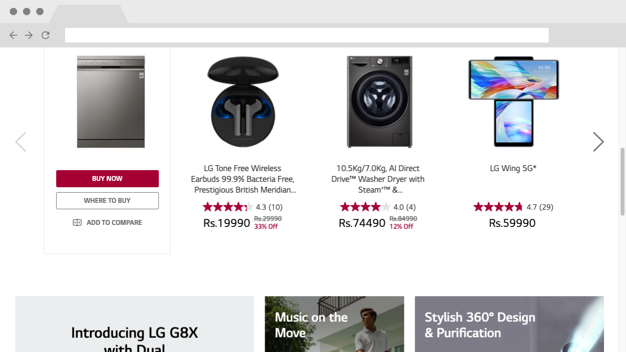
Let us open the website for LG in India in the Chrome browser on a desktop or laptop computer.

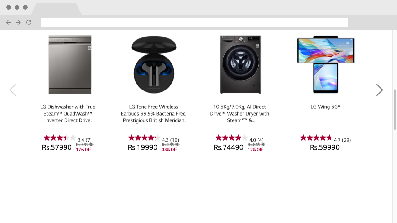
This is what the section Most popular looks like with default browser settings.
Browser settings
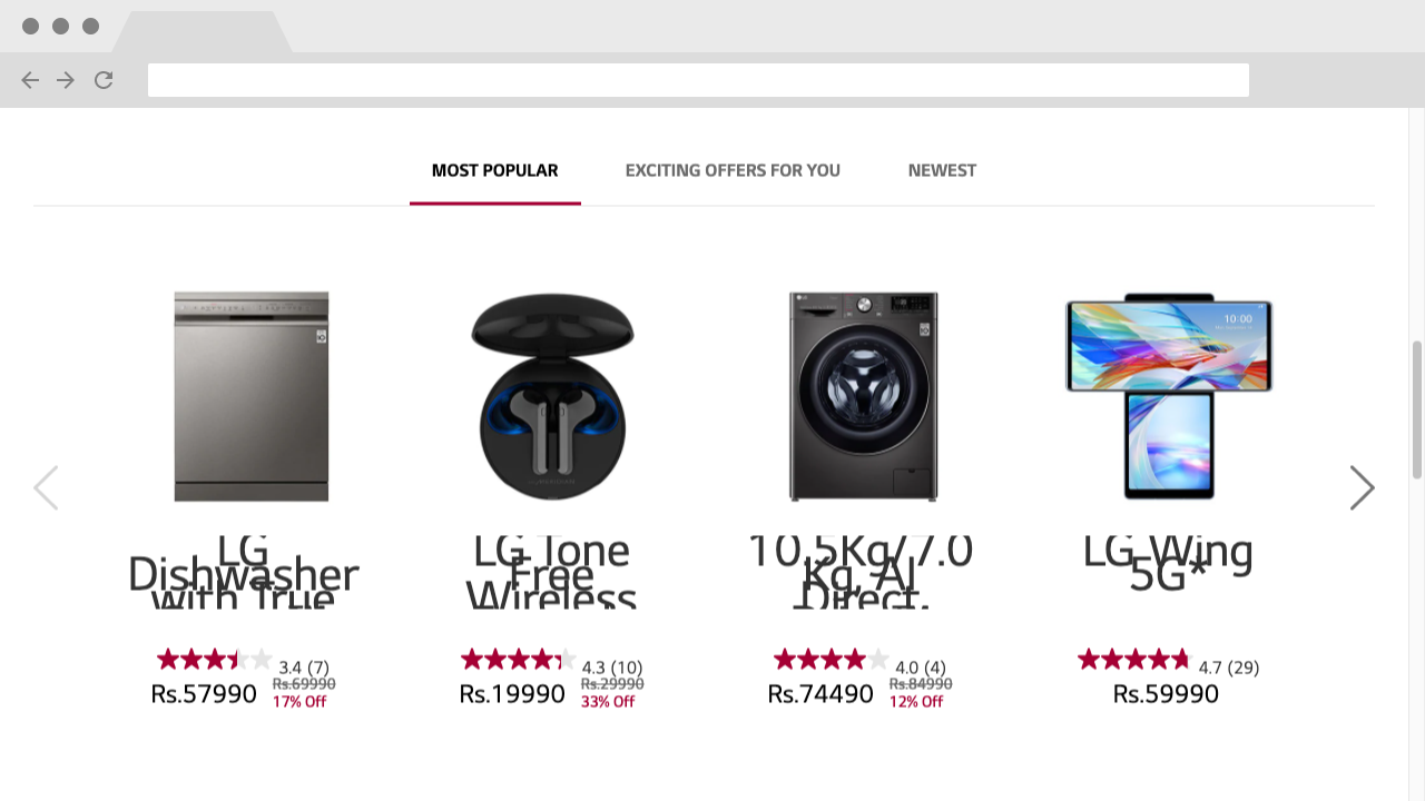
Now, in your Chrome browser, set the font size to 40 pixels. That is 2.5 times the default size. For low vision users, this is not much.

.model-name {
font-size: 18px;
line-height: 22px;
height: 66px;
overflow: hidden;
text-overflow: ellipsis;
display: -webkit-box;
-webkit-line-clamp: 3;
-webkit-box-orient: vertical;
}
Relative units
To solve this, let us try rem instead of px. 18 px is 1.125 rem if the base size is 16 px.
.model-name {
font-size: 1.125rem;
line-height: 22px;
height: 66px;
overflow: hidden;
text-overflow: ellipsis;
display: -webkit-box;
-webkit-line-clamp: 3;
-webkit-box-orient: vertical;
}

There are several reasons for this. First of all, the line-height is set in pixels. As with font size, we should avoid absolute units when setting line height. line-height can be set with a number without a unit, instead of a length. In this case, we can use line-height: 1.2; instead of line-height: 22px;
The container of the product title has height: 66px; – not a good idea when you want to support text zoom. Let us try to remove that absolute height.
The last problem is that this product title has -webkit-line-clamp: 3; that limit the text to three lines. Important information is lost.
.model-name {
font-size: 1.125rem;
line-height: 1.2;
overflow: hidden;
text-overflow: ellipsis;
display: -webkit-box;
-webkit-box-orient: vertical;
}
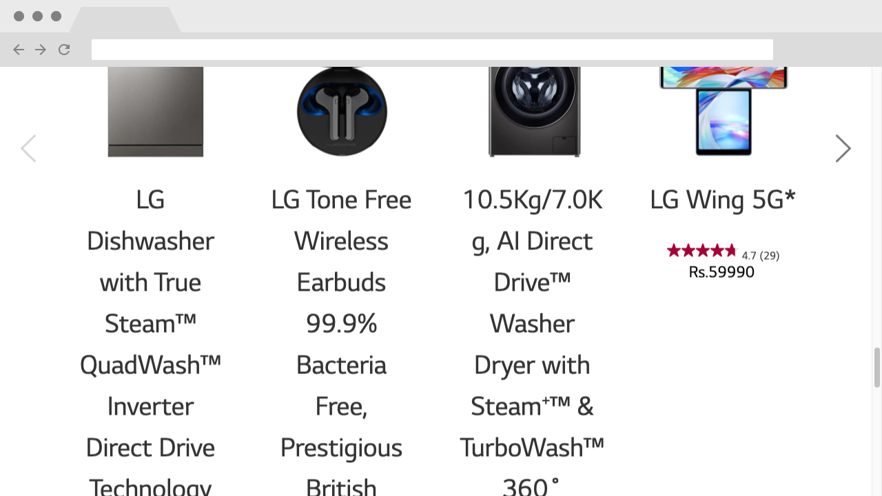
Result

Finally, large and readable text.
This course will not cover all techniques for supporting text resizing. The main takeaways are that you should test the sites you code, and strive to use relative units.

